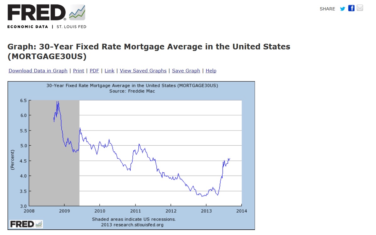
Lately, I have seen horrifying short-term graphs that show the rise in interest rates this year, and as much as I tell myself its all relative, I get fearful. So this morning, when a mortgage banker displayed the Chart Freddy Mac puts out with the rolling 5-year and 30-year fixed rate averages, I cringed, and then I pondered, and then I laughed, and laughed, and laughed….
When you look at the thirty year graph below, with its slightly bumpy, but steady decline since 1982, you realize that the latest uptick, is just the bump at the tail of that slope. Sure, it looks horrifying when you magnify it, as in the second chart, but it’s still at historical lows for those of us who matured after the mid ’70’s.
I thought back to when I was a little boy, and those dubbed sci-fi movies terrified me with giant magnified ants and scorpions, but that was about the time our nation enjoyed 3% mortgage rates too. Well, those rates have been long gone for decades, and like so many, I am older, wiser and those tricks of magnification don’t scare me any more, unless they fool me with graphs! Boy, do I feel silly.
Of course, looking at the 30-year chart, I realized I also managed to time a move or relocation to coincide with the spikes on that downward slope: 1985, ’88, ’89, ’90, ’95, 2000…so that is a little sad,
Or then again, just another reason to laugh.
The bottom line: Mortgage rates are still looking pretty good compared to the last 30 years of my life.